A Small Step for Design and Accessibility
Jul 12, 2020 | Thirafi Dide
When I share this blog to one of my friends, he pointed out 2 problems:
-
The links colour does not contrast enough with the background, making the text harder to read.
-
The inline code snippet (e.g. example) is smaller than the rest of the text, making the text, again, harder to read.
The worst part is that my previous post has inline code snippets that also a link! The blog design is simple, but yet I find a way to make it inaccessible. I'm not good with accessibility. It's one of my weak points and I want to improve on that. After all, it is essential to deliver good user experience, no matter who the user is.
Evaluation Tools
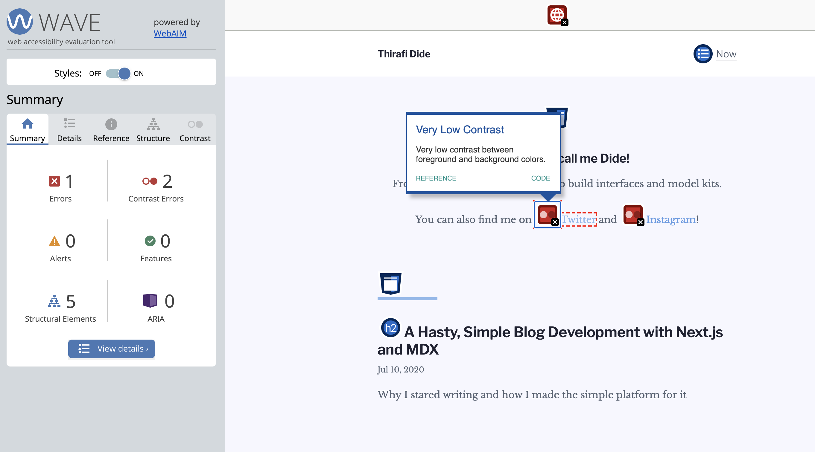
Before improving anything else, I need the means to measure "how accessible" my site is. Without this, I would not know if my works actually improve accessibility. There are some tools that can help, like lighthouse, which already built inside chrome dev tools. But, in the end, I choose to use WAVE, web accessibility evaluation tools.
WAVE is quite powerful. It can directly point out the accessibility problems inside the site and give useful information related to the problem. To use it, it offers online tools to evaluate published sites and browser extensions for chrome and firefox to help evaluate the site while in development. There is one thing that it lacks though, which is an explanation on why Web Accessibility EValuation tools are abbreviated as WAVE instead of WAEV 🧐.
Colour Contrast
Most of the problems spotted by WAVE are related to colour contrast. Though it feels easy and basic, even a big company that puts a lot of effort for accessibility like Stripe still fall for this colour contrast error. Colour contrast is easy, but have a lot of impact on user experience, even for people with perfect sight. So let's fix it!
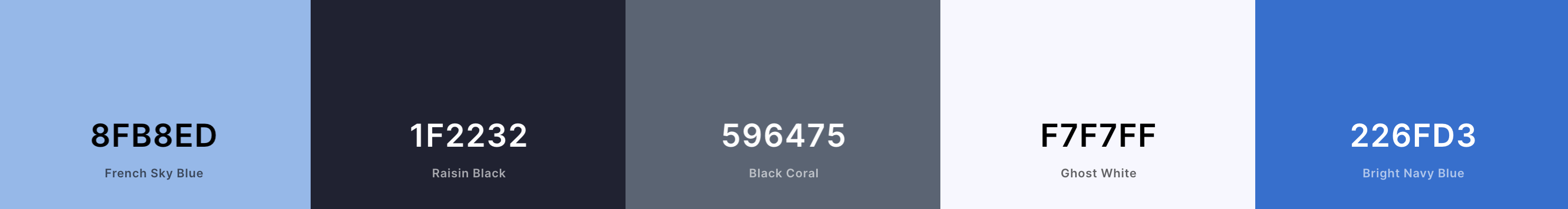
Unfortunately, the teal colour that I love is too light to use in pair with light background. To find the colour alternative, I use Coolors again and pick different shades for text-related colours, which I choose a nice bright blue (#226FD3). I still use the previous teal colour (#8FB8ED) as the main accent colour for the site, used for decoration and favicon.
WAVE gives the colours a pass, nice! To top it up, I added simple dotted underline (which actually a border-bottom, because I want more space between text and the underline) to differentiate links even more with the rest of the paragraph text. This way the links should be recognisable even with a total colour blind.
Another colour contrast problem comes from syntax highlighting that I use, which is atom-one-light. I replace it with a11y-light and do a small modification to give the code snippets a nice, thin border.
import '../styles/highlight-a11y-light.css';
For inline code, I upsize them to have the same font size with the rest of the paragraph and add background to make it slightly pop as code. Just like this!
Language and other metadata
WAVE point out the lack of lang attribute in my HTML. This was fixed with the help of custom next _document.js. I also take this opportunity to add support for Bahasa Indonesia, if I ever post Indonesian translation later.
// _document.js
import Document, { Html, Head, Main, NextScript } from 'next/document';

class MyDocument extends Document {
  static async getInitialProps(ctx) {
    const initialProps = await Document.getInitialProps(ctx);
    const { pathname } = ctx;
    const lang = pathname.startsWith('/id') ? 'id' : 'en';

    return { ...initialProps, lang, pathname };
  }

  render() {
    const { lang, pathname } = this.props;

    return (
      <Html lang={lang}>
        {/* ... */}
This also reminds me to add other essentials metadata, like title, description, and Open Graph!
Open Graph metadata
This is not about accessibility, but I think it is nowadays essential for any site to include this, with how social media dominates our communications.
Do you ever share a news link in social media, and then the social media shows a thumbnail and description of those sites? This is possible with Open Graph Protocol. That sounds like a complicated thing, but it actually isn't. All you need are couples of meta tag in document's <head>. We can use next/head component to achieve that.
<Head>
	<meta property="og:title" content={metadata.title} />
	<meta property="og:description" content={metadata.description} />
	{metadata.image && <meta property="og:image" content={metadata.image} />}
	<meta
		name="twitter:card"
		content={metadata.image ? 'summary_large_image' : 'summary'}
	/>

	<meta property="og:site_name" content={metadata.title} />
	{metadata.image && (
		<meta
			name="twitter:image:alt"
			content={metadata.imageAlt ?? metadata.title}
		/>
	)}
</Head>
I can make a reusable component that only hosts this <Head /> and render it on each MDX post. But, to reduce repetitiveness, I replace @next/mdx with next-mdx-enhanced so I can have a generic layout component for blog posts that differ from the homepage. This also allows me to use Front Matter for writing metadata inside MDX, and would help me makes actual different visual layout for blog posts in the future.
---
date: '2020-07-10'
description: 'Why I started writing and how I made the simple platform for it'
title: 'A Hasty, Simple Blog Development with Next.js and MDX'
---

It's been a while that I want to build a blog and start writing. ...
// layouts/index.js

import Head from 'next/head';
import { Metadata } from '../common/ModelMetadata';

export default function layout(frontMatter) {
  return function UIDefaultLayout({ children: content }) {
    const metadata = Metadata(frontMatter);

    return (
      <>
        <Head>
          <title>{metadata.title}</title>
          <meta name="title" content={metadata.title} />
          <meta name="description" content={metadata.description} />
          <meta name="keywords" content={metadata.keywords} />

          <meta property="og:title" content={metadata.title} />
          <meta property="og:description" content={metadata.description} />
          {metadata.image && (
            <meta property="og:image" content={metadata.image} />
          )}
          {/* ... */}
Now I just need to write metadata as front matter, and everything will set into place.
Fortunately, my blog has simple and have a straightforward structure, making it easy to optimise for accessibility. Even with the simplicity, there is still some opportunity for my blog to optimise, which is semantic HTML, which I will cover soon.
And of course, there are a lot more about accessibility, especially for a complex site with a lot of moving parts, which can be tricky to works well with voice assistance for disabilities. This is just a start for me, and probably a reminder for designers to be more mindful when choosing colours.